Creating a website that looks stunning on every device is no longer a trend—it’s a necessity. Whether you are a designer, developer, or business owner, mastering the art of responsive design is crucial in 2025. In this guide, we will walk you through everything you need to know about building a responsive website design, from fundamentals to tools, frameworks, and expert strategies.
1. What Is Responsive Web Design?
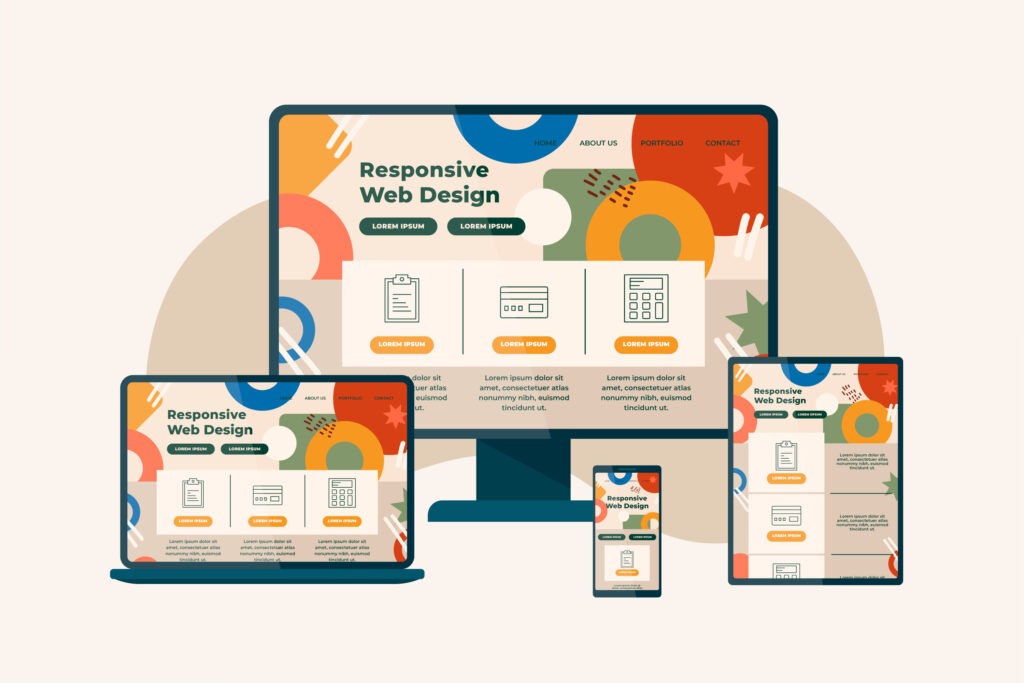
Responsive website design refers to an approach that ensures your website adjusts seamlessly across all devices—desktops, tablets, and smartphones. It uses flexible layouts, images, and CSS media queries to automatically resize content.
A great example of a site using responsive principles is Smashing Magazine, which adapts flawlessly to any screen.
If you’re just getting started with web development, we recommend checking our Beginner’s Guide to Web Development to grasp the core concepts.
2. Why Responsive Design Is Essential
Responsive design is not just about aesthetics—it impacts SEO, user experience, and conversion rates. Here’s why it matters:
Boosts SEO: Google prioritizes mobile-friendly websites.
Improves UX: Users stay longer when content is easy to navigate.
Reduces Bounce Rate: A poor layout on mobile often pushes users away.
Cost-Effective: One responsive site vs. multiple versions saves time and money.
Want to know more design strategies? Visit our blog on 10 Web Design Tips to refine your layout skills.
3. Key Elements of Responsive Website Design
Implementing responsive design involves more than resizing elements. Focus on:
Fluid Grid Layouts
Flexible Images
Media Queries
Mobile-First Approach
Optimized Typography
These building blocks form the foundation of the best responsive web page design practices.
4. How to Make a Responsive Website Design (Step-by-Step)
Here’s a simplified roadmap:
Step 1: Use a Fluid Grid
Grids allow your layout to scale. Use percentages instead of fixed pixel widths.
Step 2: Apply Flexible Images
Images should resize within their containers. Use max-width: 100% in CSS.
Step 3: Media Queries
Set breakpoints for screen sizes to adjust layout or hide/show elements.
Step 4: Test on Devices
Use developer tools in browsers and online testing platforms.
Step 5: Optimize for Performance
Minify CSS and use lazy loading for images.
Explore some best responsive design websites for design inspiration.
5. Tools and Frameworks for Creating Responsive Designs
A well-designed responsive website requires the right stack of tools:
Bootstrap
A mobile-first CSS framework with a powerful grid system. Learn more at Bootstrap Official.
Tailwind CSS
Utility-first and extremely flexible. Preferred by developers for rapid responsive prototyping.
CSS Grid & Flexbox
Use Grid for layout structure and Flexbox for alignment. Together they create flexible and modern UI layouts.
Figma & Visual Studio Code
Need a visual breakdown? Visit our UI/UX Google Course Guide to level up your design game.
6. SEO & Responsive Design
Search engines reward responsive websites. Make sure to:
For more, check our Web Design Services page for professional help.
7. Common Mistakes to Avoid
Fixing these will help you stand out among the best responsive design websites
8. Best Practices for Modern Responsive Design
💬 Frequently Asked Questions
Q1: What is responsive web design?
A: It is an approach that ensures your website adapts smoothly to all screen sizes using flexible layouts and media queries.
Q2: How to make responsive website design?
A: Use a fluid grid, flexible images, and media queries. Start with mobile-first principles and test on multiple devices.
Q3: What tools can help in responsive design?
A: Bootstrap, Tailwind CSS, CSS Grid, Flexbox, Figma, and Visual Studio Code are excellent choices.
Q4: What are the best responsive design websites to get inspiration from?
A: Websites like Awwwards showcase top responsive designs across industries.
Q5: How do I improve my current site's responsiveness?
A: Audit your design using Google’s Mobile-Friendly Test, optimize image sizes, and restructure your layout using a responsive framework.
Conclusion
Responsive website design is not just about adjusting screen sizes; it’s about creating seamless digital experiences for users, no matter the device. Start with a mobile-first approach, use flexible tools, and test rigorously.
Whether you’re a beginner or experienced in website creation, designing a fully responsive site ensures your audience enjoys a smooth, engaging experience—on any device. Use the right tools, avoid common pitfalls, and always put the user first.
Your journey to building a responsive, high-performance website starts today.